01
Two Fs, interlocked
Filippo Favaro: two Fs. The second is the first turned half a turn, and the two lock into one rounded square.
Each F owns its stem whole. Its bar runs on under the other F's stem, turning down in a quarter round that the stem cuts off, so the bar reads as passing beneath it. The middle arms run level from the stems and overlap in the centre, the first F's on top. The outline is point-symmetric: a half turn lands it on itself, the two Fs trading places.
The first F is drawn in the text colour, the turned F in a flat petrol, and a seam of the ground runs wherever the two meet, so they read as two pieces locked together. The petrol is the only colour in the mark. Drawn by Filippo, his Frame 4486.
- Pieces
- Two paths, a seam apart: the turned F and the first F
- Symmetry
- Outline point-symmetric; a half turn swaps the Fs
- Over and under
- Each bar passes under the other F's stem; in the centre the first F's arm lies over the turned F's
02
Construction and size
Drawn on a 10-unit grid. Every stroke and every slot is 90, so the solid and the open parts of the mark keep one rhythm. Then every edge is drawn in by 5, so a seam of 10 opens wherever the two Fs meet. The turned F is the first, turned 180° about the centre (here in petrol, the first F in grey).
- Outline
- A 500 square, corners r80
- Strokes
- 90: every bar, stem and arm, in both Fs
- Slots
- 90, every one
- Inside corners
- r40
- Middle arms
- Level, 220 from the stem; the two overlap by 40, the first F on top
- Arm tips
- Square on the slot side; a 10 flat and an r80 round on the other
- Under the stem
- Each bar turns down in an r65 quarter round, centred 50 inside the other F's stem, which cuts it off
- Seam
- Every edge drawn in by 5: strokes show 80, slots 100. The F that passes under stops 10 short of the one over
Keep a margin of x on every side, where x is 0.3 of the mark's width: the margin Filippo's own tile gives it. Nothing else (type, edges, other marks) comes inside it.
- Smallest on screen
- 16 px. In two colours every slot still opens at that size
- Smallest in print
- 5 mm wide
- Favicon and app icon
- On the ink tile, as drawn: the mark 62.5% of the tile, the tile rounded r40 on 800
03
Versions and lockups
The turned F is the mark's own petrol, #0288B1, flat, as drawn. The site's accent, #00769B, is the same hue a step deeper, so text reads on it and in it. Below 48 px the one-colour seam opens from 10 to 24.
-
Two-tone · light groundInk and petrol. The default.
-
Two-tone · dark groundLight grey and the same petrol.
-
Two-tone · on inkThe footer, and the header logo under the pointer.
-
One colour · inkWhere only one colour prints. The seam alone keeps the two Fs apart.
-
One colour · reversedPaper on ink, cut the same way.
-
On a light ink groundThe dark theme's footer: graphite and petrol.
 One line · header, signatures
 One line · dark ground
 Two lines · the mark as tall as both
- Filippo FavaroHeader block · the share card
The name is set in Nippo 700. In one line the mark is 1.5 times the name's size and sits 0.6 of it away, its middle on the capitals' middle, as in the site's header; in two lines it is as tall as both lines together.
04
Misuse
Keep it as drawn. Each of these breaks something the drawing holds: its reading, its proportions, its one colour or its flatness.
-
Don’t turn it
-
Don’t stretch or squash it
-
Don’t swap the colours
-
Don’t close the seam
-
Don’t recolour it
-
Don’t add effects
05
Colour
Paper. Ink on paper, with one accent: petrol, the mark's own taken a step deeper. It is the tool's colour: frames, handles, chips, pins and a button under the pointer.
- Paper#F7F5F0The page ground
- Ink#14161AText, lines, the primary button16.6:1 on paper
- Petrol#00769BThe accent: marks, frames, fills4.7:1 on paper
- Petrol text#016D8FSmall accent text5.4:1 on paper
- Petrol deep#016484Text on a petrol tint6.1:1 on paper
- Muted#5A5F67Secondary text, captions5.9:1 on paper
- Line#E2DED5The visible column rules
- Button ground#FDFCF9The secondary button
- AaOn petrol#F7F5F0Text on a petrol fill, both themes4.7:1 on petrol
- The mark's petrol#0288B1The turned F only, flat, as drawn
Graphite. Graphite, a near-neutral grey-black, so the accent is the one colour on the page: the same petrol as on paper. The light is a soft cool grey, not white, so it does not glare.
- Graphite#111417The page ground
- Light#D6DAE0Text, lines13.2:1 on graphite
- Petrol#00769BThe accent: the mark, frames, buttons3.6:1 on graphite
- Petrol text#00A0D1Small accent text, links6.1:1 on graphite
- Muted#98A1AFSecondary text7.1:1 on graphite
- Raised#171C21Panels, the secondary button
- Line#262C31Column rules
- Rule#2E3339Box edges inside panels
- Petrol marks the tool
Selection frames, their handles and size chips, the Filippo cursor, comment pins and a button under the pointer. Rows, cards and tiles flood ink, not the accent.
- Text on petrol is paper
Paper on petrol reads at 4.7:1, in both themes. Ink on it would sink (3.5:1). Small accent text is taken a step deeper on the paper, #016D8F (5.4:1).
- One colour in both themes
The fill is the same petrol on paper and on graphite (3.6:1, enough for the mark, frames and buttons). Only small accent text on the dark page is lifted, same hue, to #00A0D1 (6.1:1).
Machine states · only inside the CNC figure
- Waiting#8A6410 · 4.9:1
- Running#1E7A47 · 4.9:1
- Alarm#C22A19 · 5.3:1
Green, amber and red appear nowhere else, and every state still carries its word as well as its colour.
06
Type
Three faces, each with one job: Nippo for what is said loudest, Switzer for what is read, IBM Plex Mono for every label.
-
Display · Nippo 700
Aa Gg 01
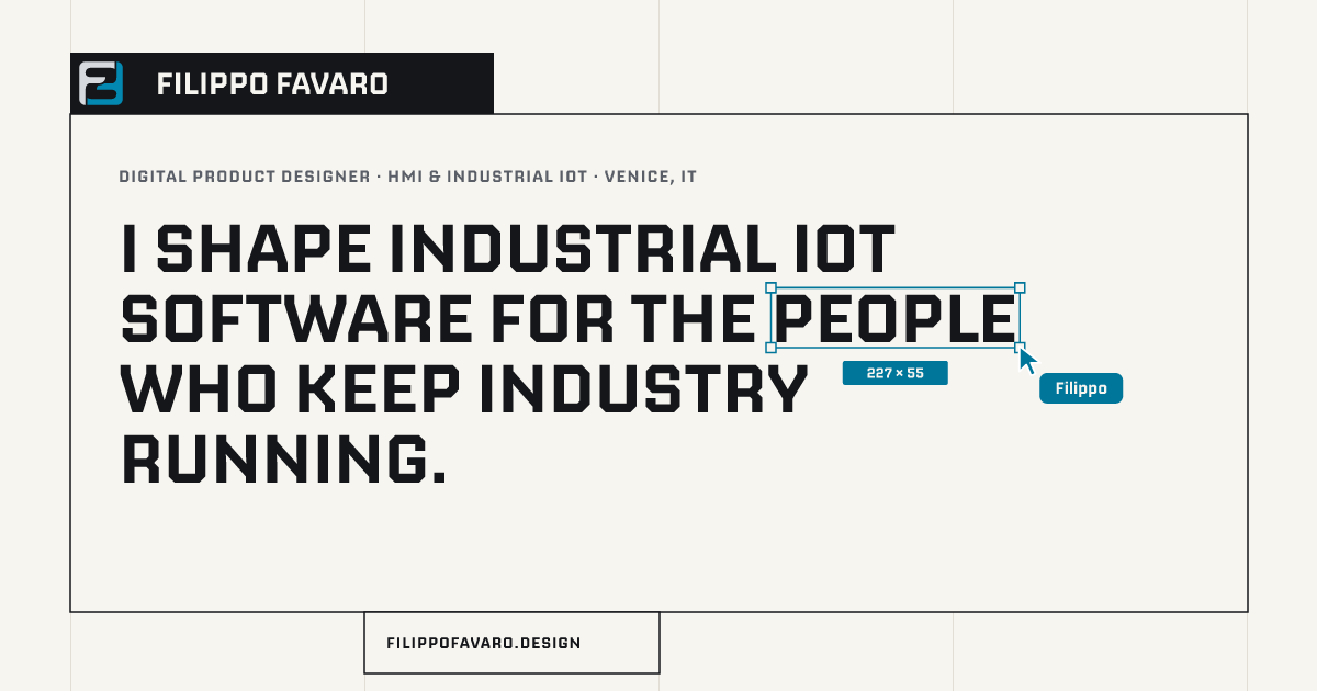
I shape industrial IoT software for the people who keep industry running.
Headings, the name, big figures. Tight leading (0.96), tracking −1%. Sentence case.
-
Text · Switzer 400 / 500
Aa Gg 01
I design the screens where machine data becomes a decision for operators, plant managers and service technicians.
Everything that is read: leads at 500, body at 400, line height 1.5.
-
Labels · IBM Plex Mono 500
Aa Gg 01
Digital product designer · HMI & industrial IoT
Every label, button, kicker and figure caption. Uppercase, tracking +6%.
-
Display XL32–99 px700 · 0.96 · −1%Page heroes
Selected work
-
Display L38–118 px700 · 0.96Section heads
Sign-offs
-
Title18–28 px650 · 1.12 · −1.5%Cards, rows
HMI and machine-interface design
-
Lead17–27 px500 · 1.45The paragraph under a hero
I design the screens where machine data becomes a decision.
-
Body16–19 px400 · 1.5Running text
Every engagement starts where the data does: the sensor, the PLC, the machine.
-
Label10.5–14 px500 · +6% · upperButtons, kickers, captions
Fig. 02.1 · Material program
Sizes are fluid between the phone and a wide desktop (CSS clamp). Headings wrap balanced; a selected word in a page hero gets the selection frame.
07
The grid and the box
Four columns with visible rules (two on phones), and every piece of content a bordered box registered to them. Neighbouring boxes overlap by exactly one pixel, so where two meet there is one line, never two.
- Gutter
- clamp(16px, 5.7vw, 104px)
- Box padding
- clamp(16px, 1.6vw, 28px)
- Tile and button height
- clamp(52px, 5.9vw, 88px)
- Between sections
- clamp(80px, 10vw, 176px)
- Hairline
- max(1.5px, 0.018em)
- Box edge
- 1 px, ink mixed into the paper (58%): #737474
08
Components
The buttons, live. Two kinds only. The primary is solid (ink, or near-white on the dark canvas); the secondary is an outline on a ground a step off the paper. Under the pointer the primary floods petrol from the point the pointer came in at; the secondary floods a light tint of it and takes its line and its text. The label rolls over. Labels are Plex Mono 500, uppercase, with an arrow.
The selection. The word that matters in a page hero is selected as a layer is in a design tool: a hairline frame, four square handles, its size in a chip, and the Filippo cursor parked at its corner. Only on page heroes, the contact headline and the word "just" on the about lines; section headings stay plain.
The word that matters
Labels. A kicker sits above every heading: the name, and after a middle dot what it is. Labels read like a frame's name on a canvas.
Digital product designerHMI & industrial IoT
Fig. 02.1 · Material program
Platform + mobile · SCM Group
09
Icons and motion
A 30-icon line set on a 24-unit grid: 1.5 stroke, square caps, mitred joins, drawn in the current text colour so it follows every flood. Each part draws itself in, and each kind has its own move under the pointer.
- The flood
- Buttons, tiles and rows fill from the exact point the pointer came in at, and drain toward where it left. Nothing lifts off the grid.
- 0.65 s · cubic-bezier(0.19, 1, 0.22, 1)
- The turn
- The mark turns half a turn under the pointer: the outline lands on itself and the two Fs trade places.
- 0.8 s · cubic-bezier(0.34, 1.56, 0.64, 1)
- Typing
- Page headings type themselves in, one keystroke apart, then the selection is dragged out over the word.
- 19ms a key · linear
- The roll
- A button label rolls up letter by letter as it floods.
- 0.6 s, 24 ms apart · cubic-bezier(0.19, 1, 0.22, 1)
- The arrival
- On the first visit the two Fs fly in from opposite corners, lock and fill; then the canvas lifts like a shutter.
- 3.3 s in all · cubic-bezier(0.16, 1, 0.3, 1)
- Reduced motion
- With the system setting on, everything is shown in place, without movement.
- prefers-reduced-motion
10
Voice
- Plain, specific sentences. Say what the work does for whom: operators, plant managers, service technicians.
- No dashes inside sentences. Use a full stop, a comma or a colon instead.
- A middle dot separates the parts of a label: Fig. 02.1 · Material program.
- A colon joins a term to its meaning: HMI: the screen on the machine.
- Headings in sentence case; labels in uppercase mono.
- Page titles end with the name: Services · Filippo Favaro.
- Nothing is written for the site that claims to be someone else's: sign-offs are quoted from letters and emails, with the source under them.
- Hero
- I shape industrial IoT software for the people who keep industry running.
- Lead
- I design the screens where machine data becomes a decision for operators, plant managers and service technicians: HMI, industrial-IoT platforms, plant dashboards and mobile companions.
- Not this
- Design problems are rarely design problems — they are people problems.
- But this
- Design problems are rarely just design problems.
- Kept as they are
- 2023 — present · EU–US · arts. 15–21
11
In use, and the files
The app icon and the favicon are the tile Filippo drew; the share card is drawn from the home page's hero. The files are outlined and ready to use as they are.

- The brand bookPDF · 24 pages · 2.1 MB
- The mark · light groundSVG
- The mark · dark groundSVG
- The mark · one colourSVG
- The mark · one colour, reversedSVG
- Lockup · one line, light groundSVG
- Lockup · one line, dark groundSVG
- Lockup · two lines, light groundSVG
- Lockup · two lines, dark groundSVG
- App iconSVG
- App iconPNG · 512 px · 8 KB