Case 02 / 05 Platform + mobile · SCM Group
SCM Digital Portal
A wall of raw numbers, rebuilt into a tool that says what to do next.
Live platform Not public
Fig. 0 · SCM Digital Portal · product walkthrough
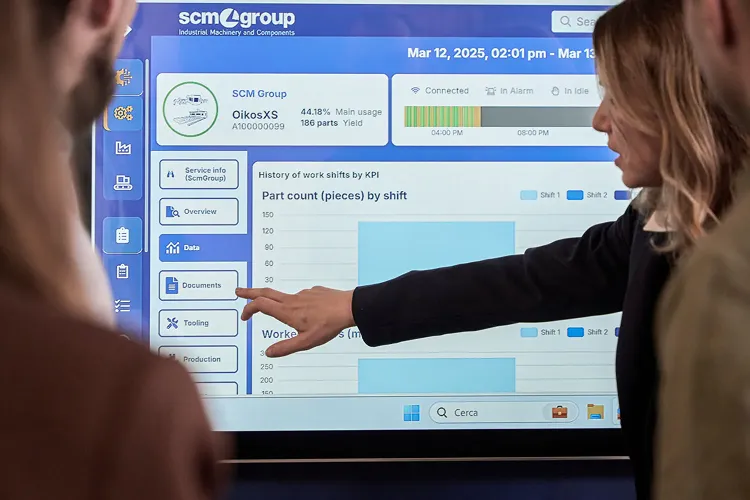
Rebuilt SCM Group’s plant-management platform, the industrial IoT layer over its machines, from a wall of raw numbers into a tool woodworking professionals actually run their shops with, then put it in their pocket. 30,000 users on more than 100,000 machines, in 40+ countries.
01of 05
Context
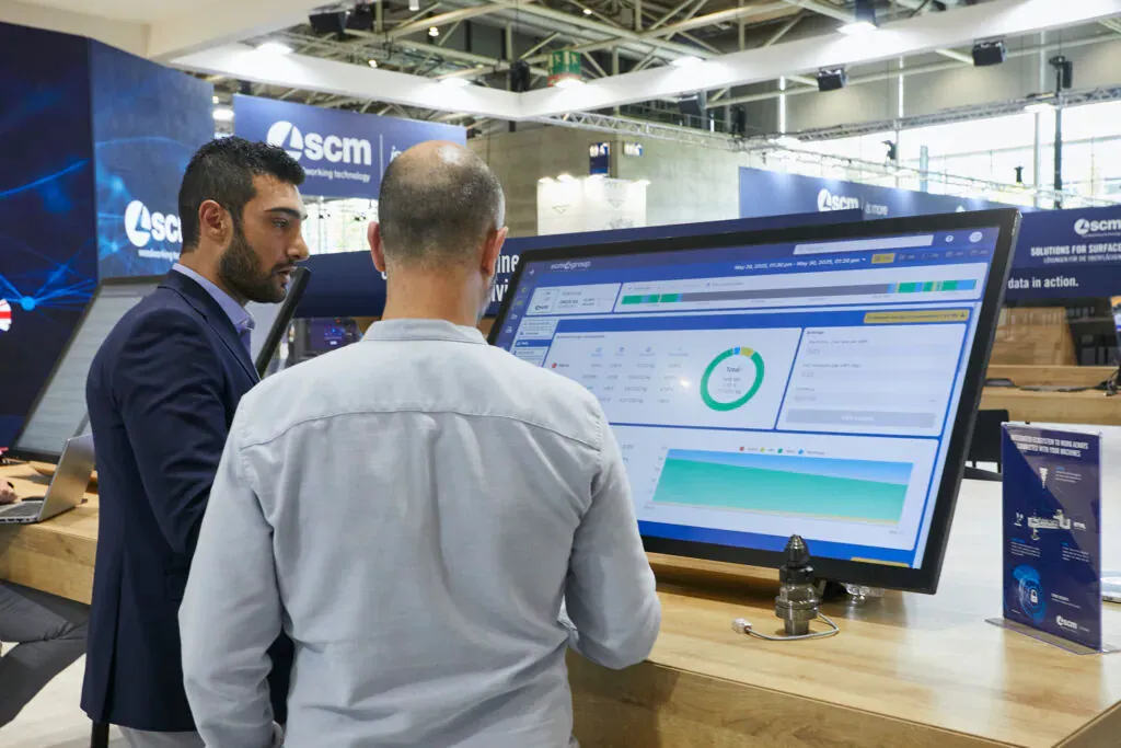
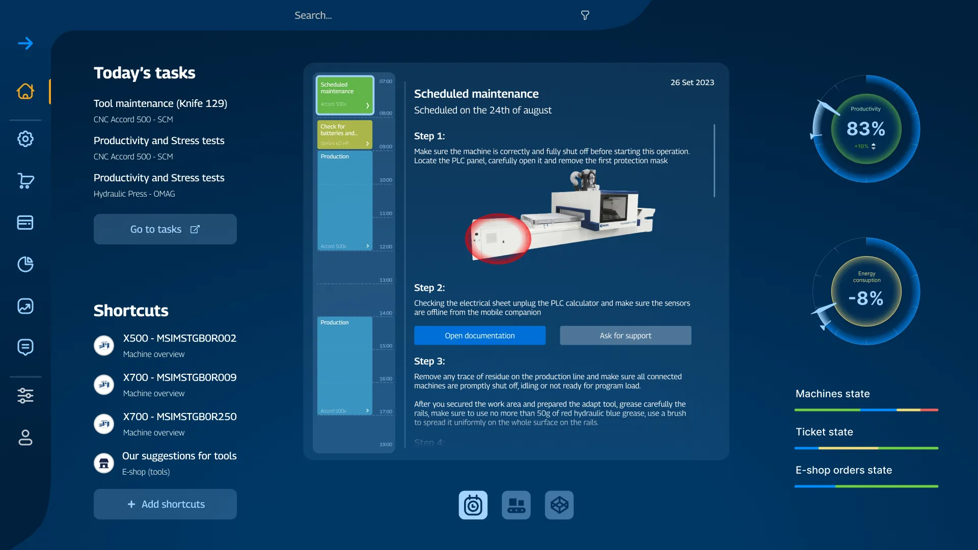
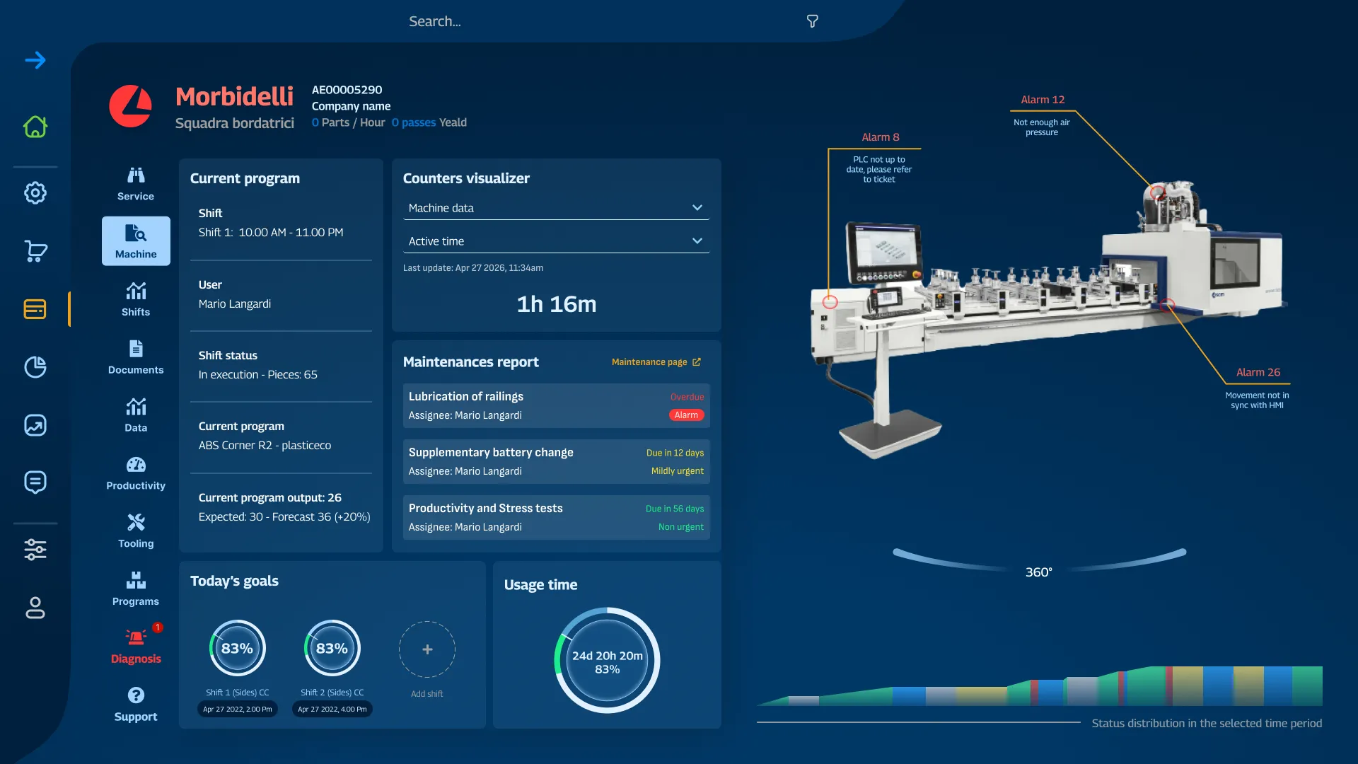
SCM Group builds the machines that cut, shape and finish wood at industrial scale. SCM Digital Portal is the plant-management platform on top of them: the industrial IoT layer, fed by the PLC on every machine, that tells a shop what its machines are doing and what needs attention. It had grown feature-first: it showed data faithfully and explained almost nothing.
02of 05
Problem
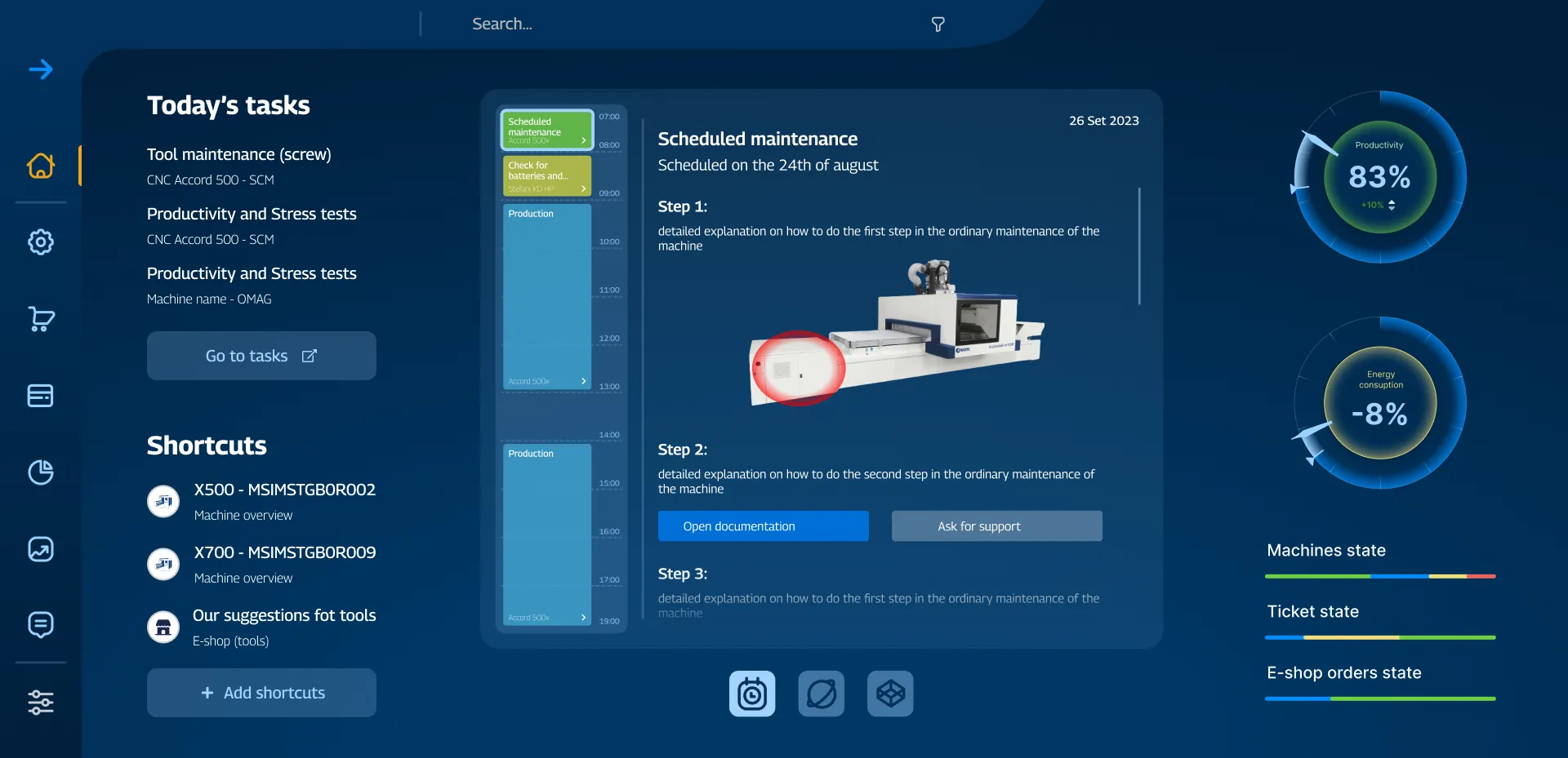
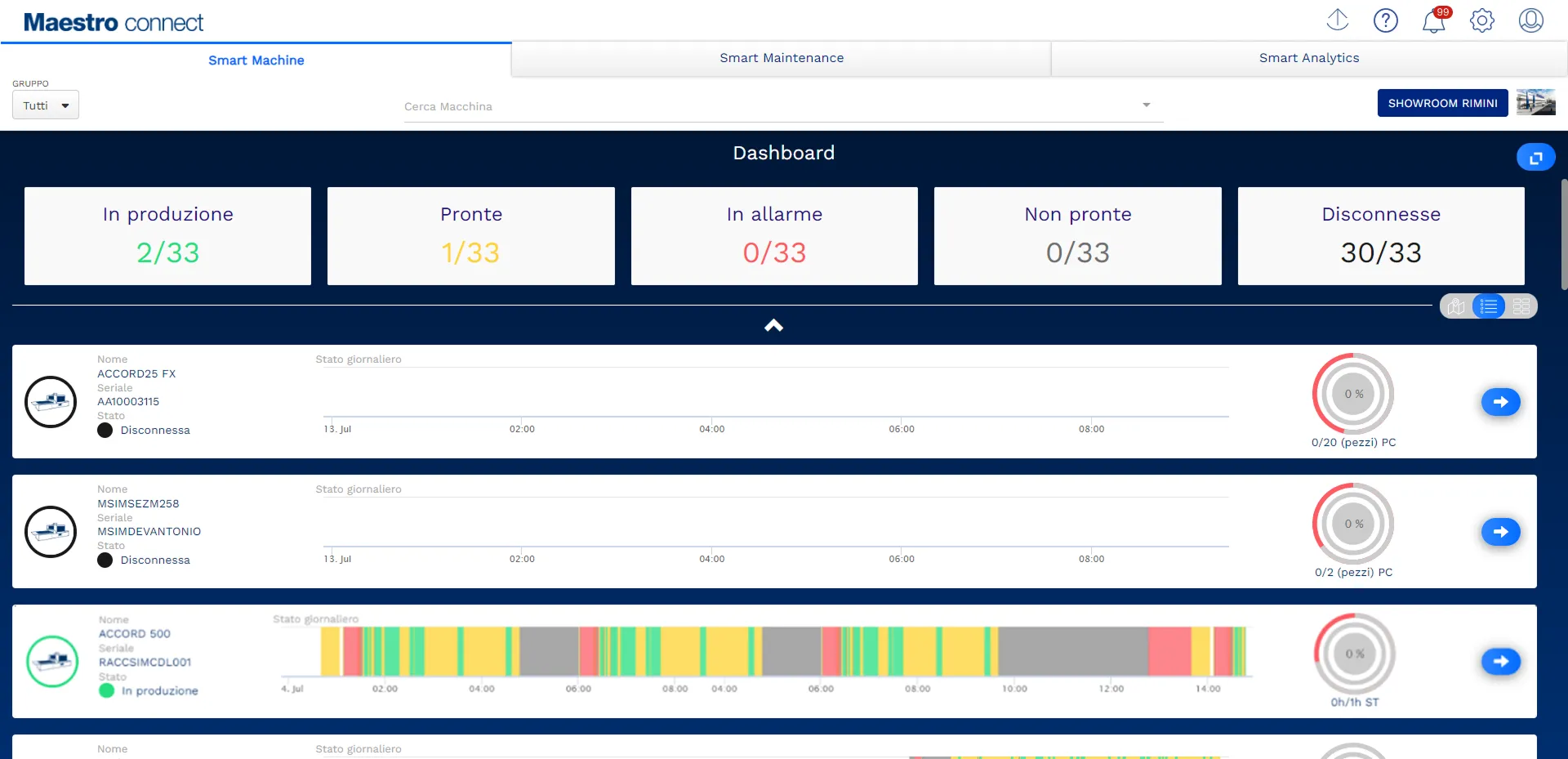
Accurate, and impossible to act on. Every screen was right and none said what to do next, so the judgement fell to the operator mid-shift. My job, leading the design team, was to reframe the product around decisions rather than data: what does this person need to know, right now, to keep the shop moving?
03of 05
Process
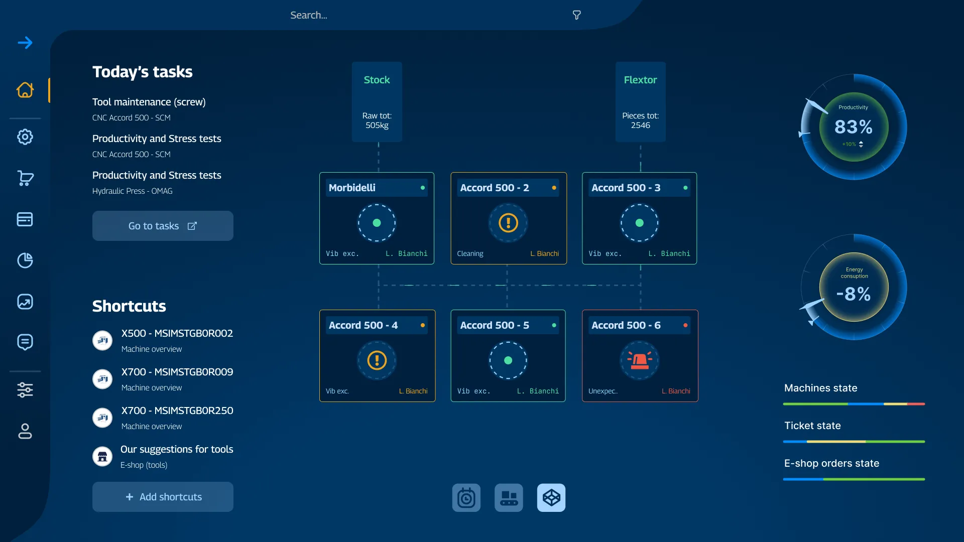
We worked from the floor up. With service engineers, shop owners and SCM’s product team we mapped the questions people bring to the screen (alarms, maintenance, throughput) and built one design system that scales from a single machine to a whole plant.
04of 05
Mobile
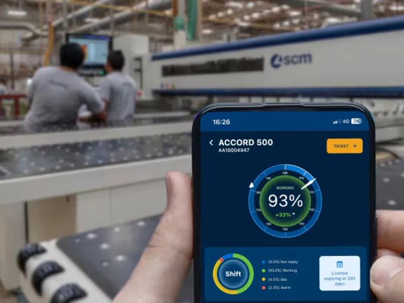
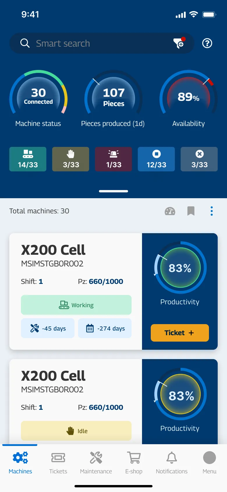
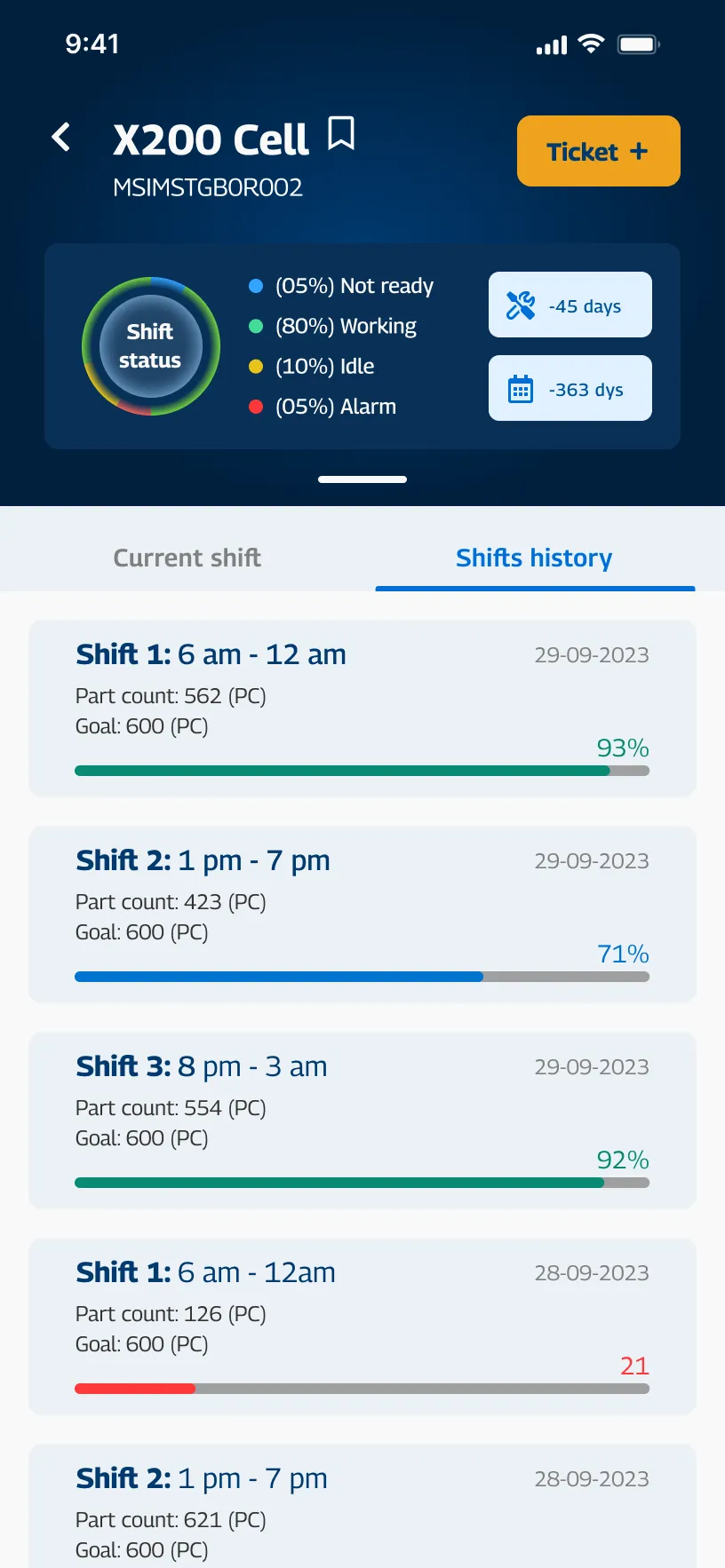
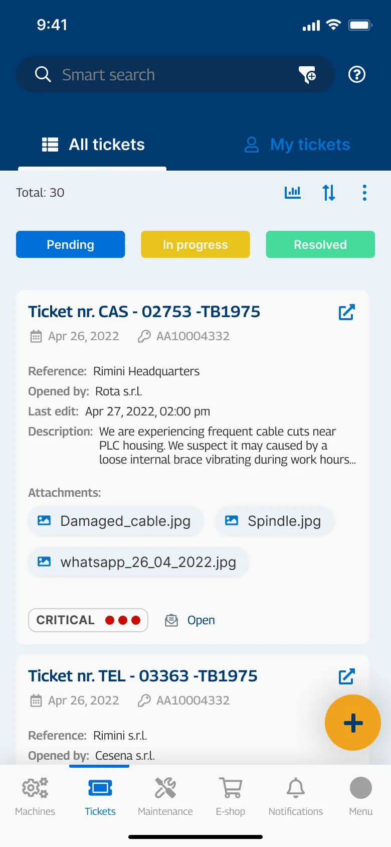
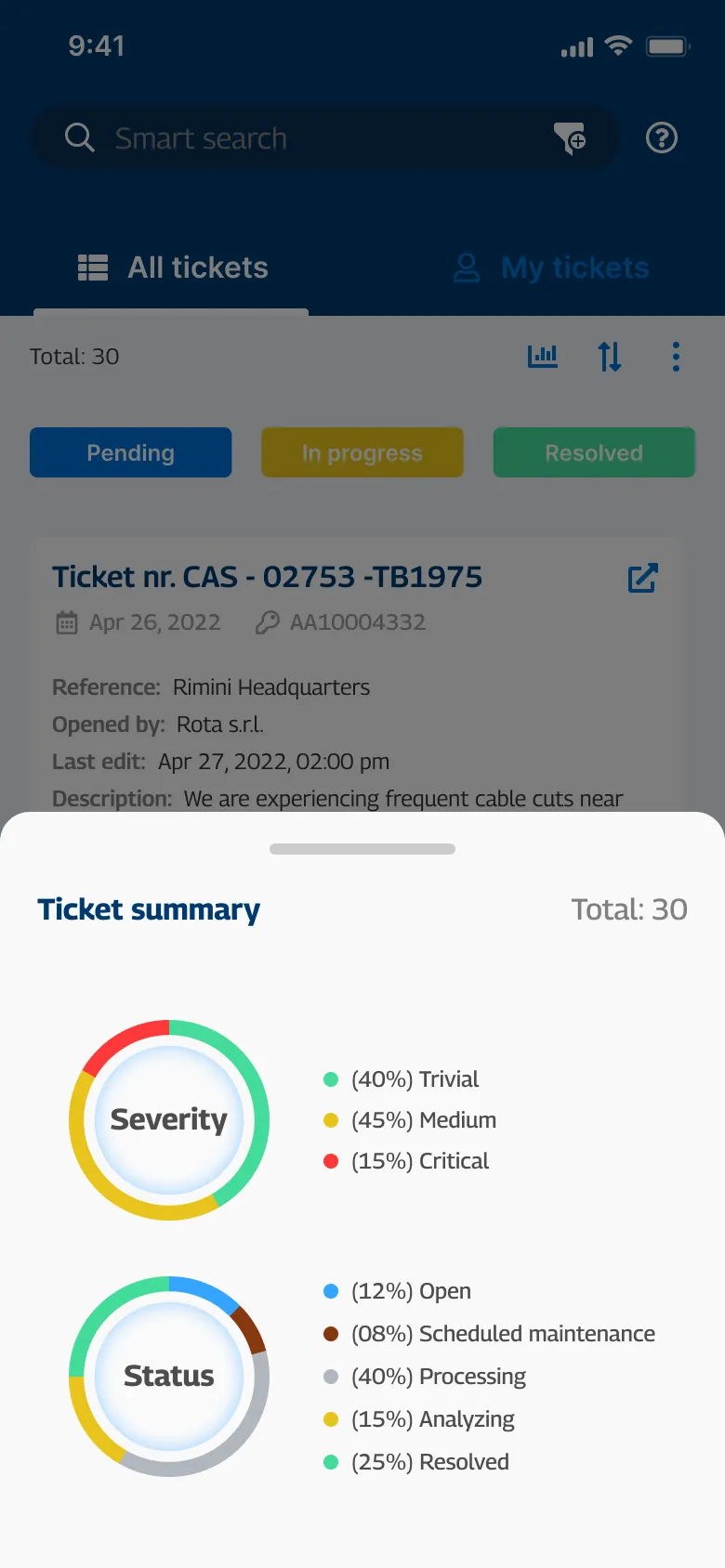
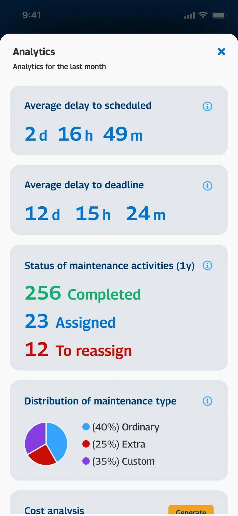
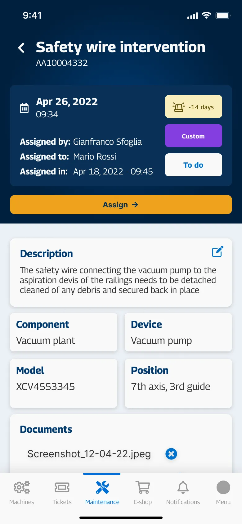
Not the desktop shrunk down. The people who run a shop are rarely at a desk. As the sole designer on it, I built the companion from a blank canvas around the moments that pull someone to their phone: a maintenance date, a ticket changing state, production drifting from plan.
05of 05
Outcome
From a data readout to a working tool. Rolled out in six months, and now run by 30,000 active users on more than 100,000 machines in over 40 countries, about 12,000 of them every weekday. A serious machine-down fault used to wait anywhere from a couple of days to two weeks for action, depending on the fault; it now reaches action in three days on average.
And the design system holds. The Portal is now SCM’s main IoT touchpoint, with more applications connecting to it, and the interface has not drifted apart.
Version history What was tried first
What it could have been
The finished screens argue for themselves. These are the forks: what was tried first, and what replaced it.
- Fork 01
A better dashboard, or a different product?
v1Rejected
A clearer wall of numbers and, honestly, a whole intermediate application, which is what sat between the two screens above. The before/after is a two-year arc in one wipe.
v2Shipped
A companion for the production day, not a readout of it. Once the product helps with each step of a shift, the data stops being the subject and becomes the means. The visual change is a consequence.
- Fork 02
What does the platform show you first?
v1Rejected
The machine list: the obvious opening screen for a fleet product, and the one everyone expected.
v2Shipped
What is coming at you. A list puts you above the plant, scanning; the people using this are inside it. I argued this hard and won it, the one fight in this project I would call decisive.
- Fork 03
How does a tooling value survive changing units?
v1Rejected
Converting the number and trusting it to read. Across 40+ countries, a figure does not travel intact.
v2Shipped
Drawing the state. Knife sharpness is legible in millimetres and hard to judge in inches; an infographic makes the problem obvious in any unit.
Signed off SCM Group
The introduction of the design department in the workflow not only improved the quality of the UI coming from the development side, but increased the reliability of the Quality Assurance testers. […] The digital portal speaks for itself, the platform has been completely turned around from a machine monitor to a plant companion, thanks to the choices and decisions made by the team after the key insights brought by the UX analysis conducted by Mr. Favaro. […] The portal is now the main IoT touchpoint for SCM with many more applications connecting to it in the future.
Email, September 2026