Case 05 / 05 Where the practice came from · TEXA · Telebit
Low level interfaces
No colour, no component library, and a 16-bit CAN frame.
Bench software Not public
Two years designing vehicle-diagnostics interfaces (HMI-grade constraints, no colour, no components, 16-bit CAN frames read directly), then a year learning that range is the harder half.
01of 04
Context
TEXA builds the diagnostic equipment a workshop plugs into a car. From September 2019 I was the UX/UI designer for its low-level interfaces, working at the bench with engineering and testing on real vehicles, and every application had to hold the safety standards of whichever manufacturer’s car was on the lift.
02of 04
Constraint
No colour: the hardware could not render it. The interface was drawn on top of the bus in a very low-level language, and the protocol set what could be shown: which data existed, which measures could be written. Everything colour normally does had to be done by structure.
That taught me the bones of design, by force. With the palette empty, the only things holding a screen together are hierarchy, order and behaviour, and you find out quickly whether yours are any good.
03of 04
Range
Telebit put all of it back, and asked for the opposite skill. From January 2021 I designed and built the front end of every one of their web and mobile applications, for technicians, HR, sales and marketing: four groups who wanted different things from the same product.
Telebit also paid for my Google UX certification, which I finished after I had left, in August 2022. It gave names to fundamentals I had been using without them, an investment a company made without ever seeing the return.
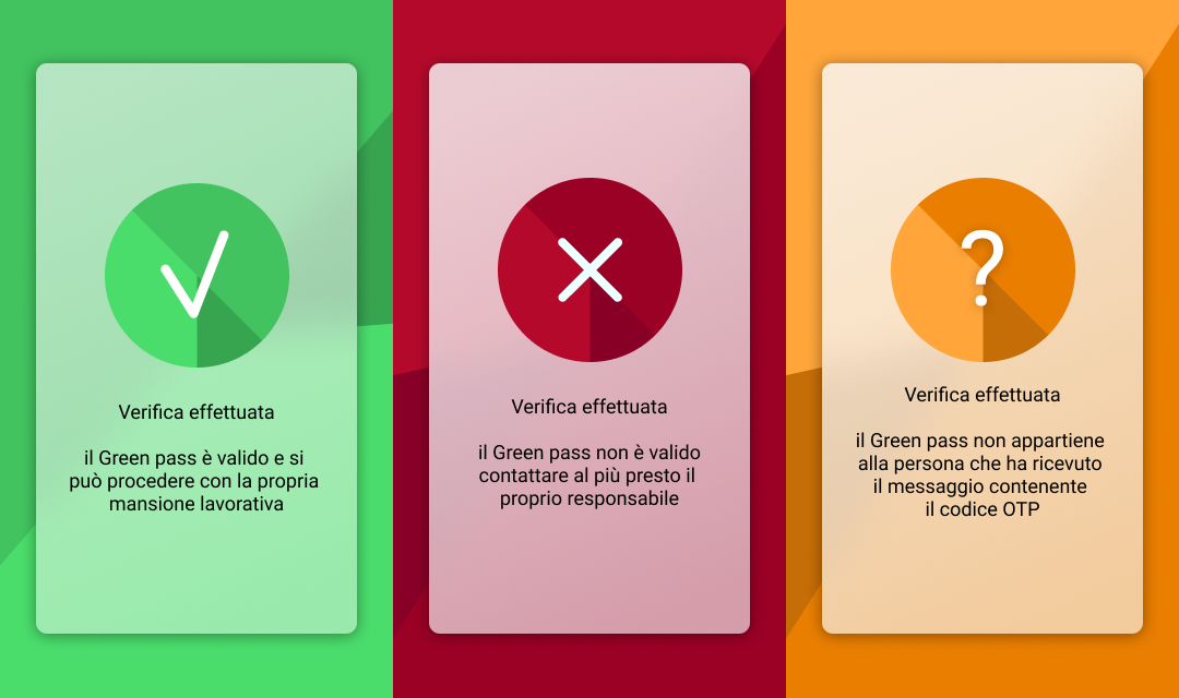
- VALID: the pass is good, start your shift. Green, and a tick.
- NOT VALID: contact your manager now. Red, and a cross.
- NOT YOURS: the pass does not belong to whoever the one-time code was sent to. Orange, and a question mark.
- Every state carries an icon as well as a colour, so none of the three depends on colour vision.
- Every message says what to do, not what happened. A person holding a phone at a factory gate has no use for a status.
- The third state exists because a pass can be borrowed. Binding it to an SMS code was what made that checkable, and it is the state nobody asks for in the brief.
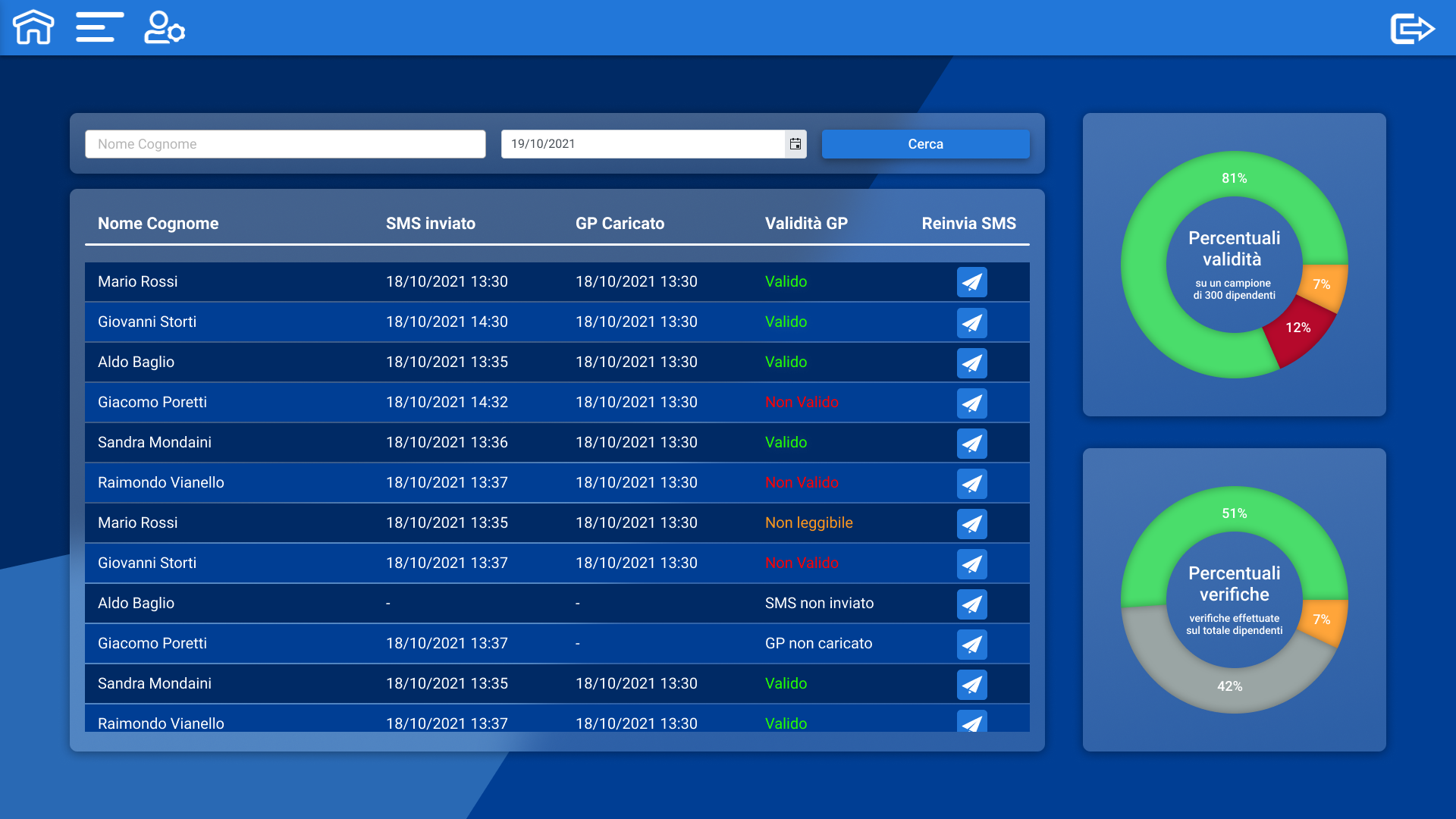
- Valido · Non valido · Non leggibile: the three ways a check can come out.
- SMS non inviato · GP non caricato: NOT failures. Nothing has happened yet, and they are kept apart from the failures so the administrator chases the right person for the right reason.
- Percentuali validità: how the completed checks came out.
- Percentuali verifiche: how much of the workforce has been checked at all. The grey 42% is the actual job, and it is the number the first chart cannot tell you.
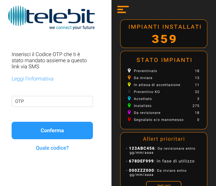
- LEFT: the green pass check. For an employee at a gate, with no training, no patience and one thing to do. Bright, two buttons, one decision.
- RIGHT: the installation manager. For a field technician tracking 359 plants across northern Italy through an eight-state lifecycle, from quoted to installed to tampered with.
- Same designer, same company, same year. They do not look alike because the people holding them were not alike, and working that out for each one is what the year was for.
04of 04
Outcome
Then Atos, on Bridgestone’s tyre-testing platform, in January 2022, and SCM Group the year after. Manufacturer safety standards, technicians with their hands full, systems that cannot afford a pretty guess: the industrial constraint set was never a specialism I picked up later. It was the only environment I had ever designed in.
Version history What was tried first
What it could have been
The finished screens argue for themselves. These are the forks: what was tried first, and what replaced it.
- Fork 01
Was the plainness right, or just familiar?
v1Rejected
The richer visual language I turned up with: habit more than judgment.
v2Shipped
The grey buttons and the numbers. A technician opening a diagnostic tool expects exactly that and recognises it instantly. I gave in for the wrong reason (inexperience, not conviction), and my colleagues were right anyway. What I kept pushing was card-like hierarchy, so a screen had an order to be read in.
- Fork 02
A calibration procedure as text, or as a drawing?
v1Rejected
Text: what the protocol documentation already was, and the cheapest thing to deliver.
v2Shipped
Diagrams, sketched and put forward. A calibration done without the correct protocol is not a poor experience but a dangerous one, and prose cannot be followed across a whole vehicle range. Some diagrams were approved; where they were not, the text shipped, and it could not be followed.
- Fork 03
Wait for a clear requirement, or interpret one?
v1Rejected
Waiting. In automotive the protocol tells you which data exists and what you may write, and I carried that expectation into Telebit.
v2Shipped
Interpreting. Outside a domain that hands you the requirement, asking for a detailed one is impossible; a designer has to reshuffle the cards and deliver what the user wanted rather than what they asked for.
- Fork 04
One tool for everyone, or one main user per tool?
v1Rejected
One tool that answers to all four groups at once.
v2Shipped
A named main user per product, everyone else second: a COVID green-pass scanner in three days for the technicians who were not in the building, the intranet for HR and marketing, the orders portal for sales. Naming the main user is the first step in winning.
Signed off Telebit
At first his job was the mockups in Figma and the matching templates and assets in Angular. With a great deal of work to do and few people to do it, he confidently took on the front-end developer’s job as well (components, services and modules in Angular) and worked closely with the back-end team through integration and testing.
Reference letter, March 2022 · translated from Italian